How to support Split View on iPad with React Native
An easy way to support iPad’s Split View on your React Native app
The article is also available on dev.to
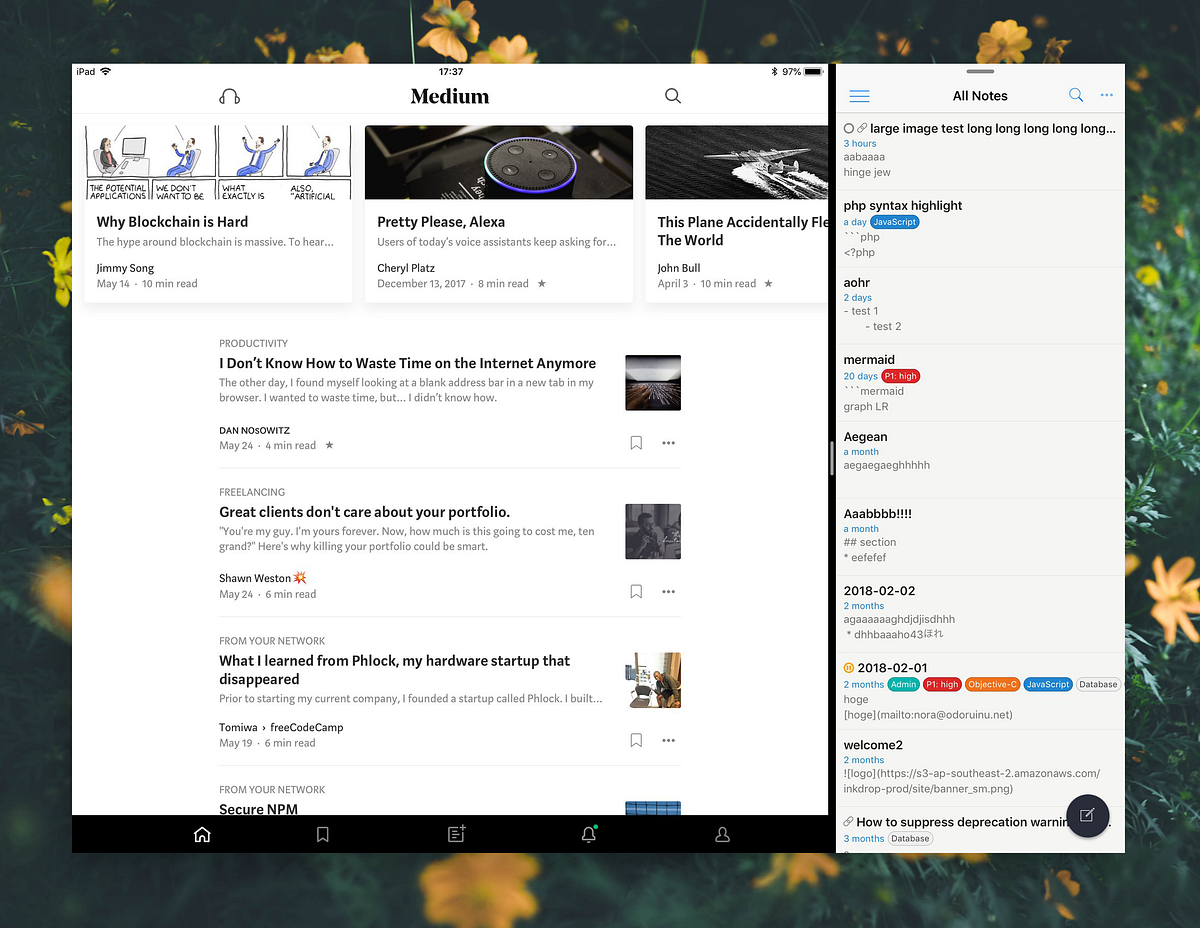
I was working on my app to support tablets. On iPad, it has a multitasking feature that allows you to use two apps at the same time by splitting screen as below:

In React Native, it needs some hacks to support this feature because there is a problem where Dimensions doesn't support it.
You always get the same data from Dimensions.get even if with the app on "Split View" or "Slide Over" on iPad:
console.log(Dimensions.get('screen')) // {fontScale: 1, width: 768, height: 1024, scale: 2}
console.log(Dimensions.get('window')) // {fontScale: 1, width: 768, height: 1024, scale: 2}
So you need to get an actual window size somehow.
To accomplish it, you have to have a view the outermost of your views with flex: 1 style.
And set onLayout event to get its size, and remember it somewhere like Redux store.
Adaptable Layout Provider / Consumer
Here is code snippets to easily support for split view on your app.
It takes provider-consumer pattern but doesn’t depend on React’s Context API because it stores the state to Redux store.
Provider
// @flow
// adaptable-layout-provider.js
import * as React from 'react'
import { View, StyleSheet } from 'react-native'
import { compose, withHandlers, pure, type HOC } from 'recompose'
import actions from '../actions'
import withDispatch from '../utils/with-dispatch'/**
* <View onLayout={...} />
* <FlatList onLayout={...} /> (FlatList is just wrapper for View)
*
* @see https://facebook.github.io/react-native/docs/view.html#onlayout
*/
export type OnLayout = {|
nativeEvent: {|
layout: {|
x: number,
y: number,
width: number,
height: number
|}
|}
|}type Props = {
children: React.Node
}const enhance: HOC<*, Props> = compose(
withDispatch(),
pure,
withHandlers({
emitDimensionChanges: props => (event: OnLayout) => {
const { dispatch } = props
const { width, height } = event.nativeEvent.layoutdispatch(actions.viewport.update({ width, height }))
}
})
)const Provider = enhance(props => (
<View style={styles.container} onLayout={props.emitDimensionChanges}>
{props.children}
</View>
))export default Providerconst styles = StyleSheet.create({
container: {
flex: 1
}
})Consumer
// @flow
// adaptable-layout-consumer.js
import * as React from 'react'
import { compose, pure, type HOC } from 'recompose'
import connect from '../utils/connect-store'type Props = {
renderOnWide?: React.Node,
renderOnNarrow?: React.Node
}const enhance: HOC<*, Props> = compose(
connect(({ viewport }) => ({ viewport })),
pure
)const Consumer = enhance(props => {
const { viewport } = props
// may return nothing:
// 1. renderOnWide set but we have narrow layout
// 2. renderOnNarrow set but we have wide layout
let children = null
const wideLayout = viewport.isTabletif (wideLayout === true && props.renderOnWide) {
children = props.renderOnWide
} else if (wideLayout === false && props.renderOnNarrow) {
children = props.renderOnNarrow
}return children
})export default ConsumerReducer
// @flow
// reducers/viewport.js
import type { ViewportActionType } from '../actions/viewport'
import * as viewportActions from '../actions/viewport'
import { Dimensions } from 'react-native'
export type Dimension = {
width: number,
height: number
}export type ViewportState = {
width: number,
height: number,
isLandscape: boolean,
isPortrait: boolean,
isTablet: boolean,
isPhone: boolean
}function isLandscape(dim: Dimension) {
return dim.width >= dim.height
}function isTablet(dim: Dimension) {
return dim.width >= 1024
}const dim: Dimension = Dimensions.get('window')
export const initialViewportState: ViewportState = {
width: dim.width,
height: dim.height,
isLandscape: isLandscape(dim),
isPortrait: !isLandscape(dim),
isTablet: isTablet(dim),
isPhone: !isTablet(dim)
}export default function viewport(
state: ViewportState = initialViewportState,
action: ViewportActionType
): ViewportState {
switch (action.type) {
case viewportActions.VIEWPORT_UPDATE:
const dim = action.payload
return {
...action.payload,
isLandscape: isLandscape(dim),
isPortrait: !isLandscape(dim),
isTablet: isTablet(dim),
isPhone: !isTablet(dim)
}
default:
return state || initialViewportState
}
}Action
// @flow
import { type Dimension } from '../reducers/viewport'
export const VIEWPORT_UPDATE = 'VIEWPORT_UPDATE'
export type ViewportActionType = {
type: 'VIEWPORT_UPDATE',
payload: Dimension
}export function update(dim: Dimension) {
return {
type: VIEWPORT_UPDATE,
payload: dim
}
}In this example, it stores window size to Redux store.
However you can also store it in global variables, which I don’t recommend though but it’s just simple.
How to use it
In your root view component:
const RootView = () => (
  <AdaptableLayoutProvider>
    <MainScreen />
  </AdaptableLayoutProvider>
)
In your screen component:
const MainScreen = props => {
  return (
    <AdaptableLayoutConsumer
      renderOnNarrow={
        <MobileLayout />
      }
      renderOnWide={
        <ThreeColumnLayout />
      }
    />
  )
}
Hope that helps!
- Follow me on Twitter
- Try Inkdrop — Note taking app for Markdown Lovers


